

Table of Contents
- Start with a Design Vision for Your Space
- Build Your Foundation with a Neutral Base Color
- Apply the 60-30-10 Rule Interior Design Strategy
- Master Texture Layering and Material Balance
- How to Mix Furniture Styles Without Clashing
- How to Create Flow Between Rooms
- Use Lighting and Transitional Spaces to Unify Your Home
- Practical Tools and Budget-Friendly Tips
Last Updated: August 6, 2026
Start with a Design Vision for Your Space
Creating a cohesive interior begins with a clear design vision. Before purchasing furniture or accessories, define what cohesion means for your space. At Caltucky Creations, we help customers understand that cohesion isn't about matching everything perfectly, it's about intentional coordination where every element serves a purpose within your overall design framework.
Ask yourself: What mood do I want this room to evoke? A calm, minimalist sanctuary or a warm, eclectic gathering space? Your design vision becomes the compass guiding every decision. Without it, you'll end up with individually nice items that feel disconnected as a whole.
Gather inspiration through mood boards using Pinterest, Instagram, or magazine clippings. Look for patterns in what draws you in, color families, material textures, furniture silhouettes. Your mood board reveals your aesthetic preferences and keeps you accountable when tempted by beautiful but off-brand pieces.
Document your vision in writing with 3-4 sentences describing your ideal room: dominant colors, primary materials, and the feeling someone should have upon entering. This statement prevents impulse purchases that undermine design consistency.
Build Your Foundation with a Neutral Base Color
The neutral base is your design's backbone, creating spatial harmony by providing visual rest and allowing accent pieces to shine. Most successful interiors rely on a dominant neutral covering 60-70% of your room through walls, large furniture, or flooring.
Common neutral options include warm whites, soft grays, warm beiges, and muted taupes. Understanding undertones is key: gray with blue undertones feels cool and modern, while gray with warm undertones feels cozy and traditional. North-facing rooms benefit from warmer neutrals to counteract cool light, while south-facing rooms can handle cooler neutrals.
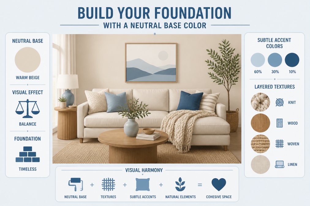
Layer texture within your neutral palette to create visual interest. A cream-colored wall paired with a natural linen sofa, wool area rug, and weathered wood furniture creates richness and depth while maintaining cohesion. Using different shades and tints of your chosen neutral adds sophistication without introducing competing colors.
Test paint samples on your walls at different times of day. Ensure your neutral complements your wood furniture undertones, cool gray walls with warm wood furniture creates visual discord.
Apply the 60-30-10 Rule Interior Design Strategy
The 60-30-10 rule is a proven formula for cohesive rooms. Allocate 60% to your dominant color (neutral base, walls, large furniture), 30% to a secondary color (sofa, area rug, window treatments), and 10% to accent colors (throw pillows, artwork, decorative accessories).
This mathematical approach prevents visual clutter and creates intentional balance. When clients apply this formula, they report feeling more confident in purchasing decisions because they know exactly what percentage each item should occupy.
Audit your current space by estimating color percentages. If you're at 50-35-15, you have too much secondary color competing for attention. Shift items or add neutral pieces to restore balance. While variations like 70-25-5 or 50-40-10 work depending on preference, the principle remains: dominant color creates calm, secondary color adds interest, accent colors provide personality.
Master Texture Layering and Material Balance
A cohesive room requires intentional texture layering. Texture creates visual and tactile interest while maintaining cohesion through material repetition. Without texture variation, even a perfectly coordinated color palette feels flat.
Identify your primary material, wood, metal, textiles, or a mix. Most successful interiors balance hard and soft materials. A room with only hard surfaces feels cold and institutional; only soft materials feels heavy and dated.
Layer textures through different elements: start with flooring and largest furniture pieces, then add textiles (area rugs, throw blankets, curtains), then smaller accessories (throw pillows, artwork, decorative objects). A warm gray sofa paired with a chunky knit throw, natural linen area rug, and weathered wood side tables creates visual interest through texture variation without introducing new colors.
Repetition creates cohesion. If you use natural wood in furniture, repeat it in smaller pieces, picture frames, and side tables. If you introduce woven textures in your area rug, echo that texture in baskets or lamp bases. Mixing new and vintage pieces with visible patination (aged wood, distressed metal, worn leather) creates depth while maintaining cohesion through shared neutral tones.
How to Mix Furniture Styles Without Clashing
You can successfully mix furniture styles by anchoring them to your design vision and color palette. The key is understanding scale and proportion, a delicate mid-century modern chair can coexist with a chunky contemporary sofa if both pieces respect the room's scale.
Establish a dominant style and use secondary styles as accents. If your vision is modern with vintage touches, let modern pieces form your foundation (sofa, bed frame, primary storage) and introduce vintage elements through accessories and secondary furniture.
Color and material repetition make style mixing work. A mid-century modern side table and contemporary bookshelf don't clash if both are made of natural wood with similar undertones. A traditional wingback chair and modern sectional coexist peacefully when both are upholstered in the same neutral fabric.
Avoid mixing too many styles. Two or three complementary styles work beautifully; five different eras create visual noise. Establish your primary style, choose one complementary secondary style, and use that framework to guide all furniture selections.
How to Create Flow Between Rooms
Visual flow between rooms separates a cohesive home from disjointed separate spaces. Flow doesn't mean identical rooms, it means intentional visual continuity that guides the eye smoothly from one space to another.
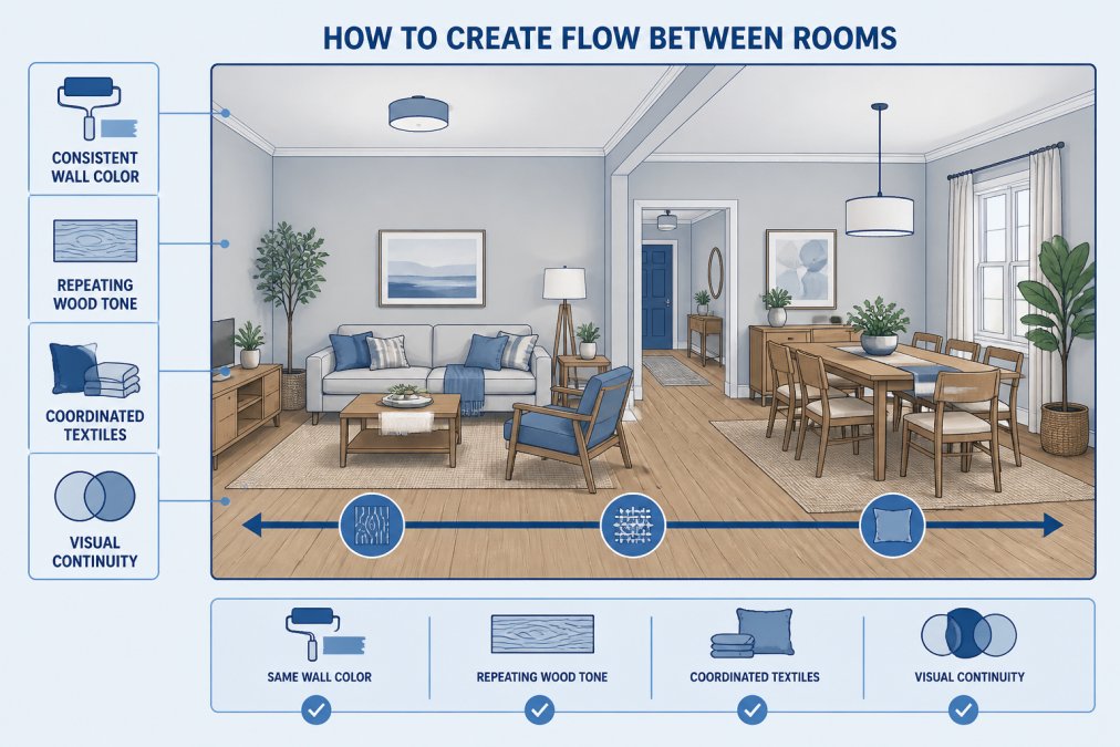
Maintain your neutral base throughout adjacent spaces. If your living room features warm white walls, carry that neutral into your dining room or hallway. Warm white, soft cream, and pale taupe can coexist in adjacent rooms if they share the same undertone family.
Repeat key design elements across rooms. If your living room features natural wood, introduce similar wood tones in your hallway or bedroom. If your primary textile is chunky knit, echo that texture in another room through a throw blanket or upholstered piece.
Use transitional spaces strategically. Hallways and entryways should share color and material elements from both adjacent rooms, creating a visual bridge. Maintain consistent accent colors across rooms, if teal is your 10% accent color in the living room, introduce it again in the bedroom or kitchen to create cohesion.
Consider sightlines. When standing in one room, what do you see into adjacent spaces? These sightlines should feel harmonious. If your living room features warm tones and you look directly into a cool-toned bedroom, the contrast jars the eye.
Use Lighting and Transitional Spaces to Unify Your Home
Lighting is the most underrated cohesion tool. The right lighting scheme unifies your home by creating consistent ambiance and highlighting design elements intentionally.
Establish a consistent lighting temperature throughout your home. Warm white light (2700K) creates coziness in living rooms and bedrooms. Cool white light (4000K) suits kitchens and workspaces. Mixing temperatures creates visual discord.
Layer your lighting in each room: ambient lighting (overhead fixtures or recessed lights) provides general illumination, task lighting (desk lamps, under-cabinet lights) serves functional purposes, and accent lighting (wall sconces, picture lights) highlights artwork or architectural features.
Coordinate your light fixtures through shared design language. If your living room features brass fixtures, carry brass accents into your bedroom and hallway. If your kitchen has matte black fixtures, introduce matte black in other rooms through hardware or picture frames.
Transitional spaces deserve special attention. Hallways, entryways, and staircases are your home's connective tissue. Paint them in your neutral base, add lighting that matches adjacent rooms, and include carefully chosen decorative elements that echo your design vision.
Maximize natural light by keeping window treatments consistent in color and material. If your living room features linen curtains in cream, your bedroom curtains should share similar qualities.
Practical Tools and Budget-Friendly Tips
Creating a cohesive home requires intentionality, not a large budget. Many effective cohesion strategies cost nothing beyond thoughtful arrangement of what you already own.
Start with an audit of your current possessions. Photograph everything and arrange the photos on a board or document. This visual assessment reveals color clustering, material repetition, or style conflicts that inform your next steps.
Establish a purchase rule: Before buying anything new, ask, Does this align with my design vision? Does it fit my color palette? Does it repeat a material or texture I've introduced? Does it respect my room's scale? If you answer no to any question, don't buy it.
Use Caltucky Creations' curated collections as starting points. Rather than piecing together a room from dozens of sources, shopping from a carefully curated retailer ensures pieces are designed to work together.
Budget strategically. Invest in large furniture pieces that anchor your room for years, your sofa, bed frame, and dining table should reflect your design vision precisely. Spend less on smaller accessories and textiles that are easier and cheaper to swap out as tastes evolve.
Create a color palette document with your dominant color (with specific paint name or hex code), secondary color, and three accent colors. Keep this document when shopping and reference it before every purchase.
| Strategy | Time Investment | Cost Level | Impact on Cohesion |
|---|---|---|---|
| Establish design vision | 1-2 hours | Free | Foundation for all decisions |
| Create mood board | 2-3 hours | Free | Visual reference and inspiration |
| Paint walls neutral base | 1 day | Low | Immediate visual transformation |
| Layer textures intentionally | Ongoing | Low-Medium | Adds depth and visual interest |
| Repeat key materials | Ongoing | Medium | Creates visual threads throughout |
| Coordinate lighting | 2-4 hours | Medium | Unifies ambiance across rooms |
| Audit and arrange | 2-3 hours | Free | Reveals patterns and gaps |
Document your progress with photos. Take before photos, then document changes as you implement cohesion strategies. This visual record shows your progress and provides motivation to continue refining your design.
Creating a room that looks cohesive transforms your entire home. When every element works together intentionally, your space becomes a reflection of your personal style and a sanctuary you genuinely want to spend time in. The strategies in this guide, establishing a design vision, building a neutral base, applying the 60-30-10 rule, mastering texture layering, mixing styles thoughtfully, creating flow between rooms, and using lighting strategically, work together to create visual harmony.
The most important first step is defining your design vision. Everything else flows from that clarity. At Caltucky Creations, we believe that a cohesive home starts with understanding what you actually want, then finding pieces that support that vision. Our curated collection of home essentials is designed to help you express your personal style while maintaining the visual continuity that makes a space feel intentional and welcoming. Explore our catalog and discover pieces that align with your design vision, pieces that don't just look beautiful individually, but work together to create the cohesive home you've been imagining.
Frequently Asked Questions
How do you make a room look cohesive on a budget?
Start with one neutral base color for walls and larger furniture pieces, then add affordable accent items in two complementary colors using the 60-30-10 rule. Shop for pieces with repeating textures or materials rather than matching sets. Thrift stores and sales sections often have items that fit a cohesive aesthetic without breaking the budget. Focus on visual flow through lighting and arrangement before buying new items.
What is the 60-30-10 rule in interior design?
The 60-30-10 rule divides your color palette into three parts: 60% dominant color (usually neutral), 30% secondary color, and 10% accent color. This ratio creates balance and prevents visual clutter while allowing personality to shine. The dominant color typically covers walls and large furniture, the secondary fills medium pieces, and the accent appears in accessories and focal points. This framework helps make a room look cohesive without feeling monotonous.
Does furniture have to match to look cohesive?
No. Matching furniture can actually feel rigid. Instead, focus on repeating design elements like color undertones, textures, and scale. Mix styles by ensuring pieces share a common thread, warm vs. cool tones, modern with vintage, or similar wood finishes. A cohesive room relies on visual continuity through these repeated elements rather than identical pieces. This approach creates a more personal, layered aesthetic.
How do I know if my room design will actually work before buying pieces?
Create a mood board using photos, paint swatches, and fabric samples to visualize your design aesthetic before purchasing. Digital tools like Pinterest or design apps let you test color combinations and furniture placement. Take photos of your space with different lighting conditions to see how colors appear throughout the day. Start with foundational pieces (neutral base, key furniture), then add accent items gradually to test the visual flow before committing to larger purchases.
This article was written using GrandRanker