

Table of Contents
- Choose the Right Garment Quality and Fabric
- How to Choose T-Shirt Printing Methods
- Master Color Theory and Palette Selection
- Typography and Font Selection for Maximum Impact
- Best Software for T-Shirt Design
- T-Shirt Design Trends for Small Business
- File Preparation and Print-Ready Design Essentials
- Common T-Shirt Design Mistakes to Avoid
- Frequently Asked Questions
Last Updated: September 17, 2026
Choose the Right Garment Quality and Fabric
When you're applying t-shirt design tips for small businesses, the garment itself matters as much as the design. Pick the wrong fabric weight or blend, and your beautiful design sits on a shirt that falls apart after five washes. Pick the right one, and you've got a walking advertisement that actually lasts.
The difference between a cheap blank and a quality one comes down to three things: fabric weight, fiber content, and construction details. A lightweight tee feels great in summer but shows every wrinkle and fades faster. A heavier cotton holds up through repeated washing and makes your design look sharper because the fabric has more body.
Weight and Feel Matter More Than You Think
Fabric weight is measured in ounces per square yard. Most quality blanks range from 4.2 to 5.3 oz/yd². A 4.2 oz lightweight feels soft and breathable, perfect for layering or warm climates. A 5.3 oz medium-weight tee is tougher and shows off print detail better. The heavier the fabric, the longer it lasts.
Think about your customer's lifestyle. Are they wearing this to the gym, to the office, or to bed? A lightweight jersey works great for active wear. A heavier cotton is your best bet for something that needs to survive the dryer twenty times without looking sad.
Cotton vs. Blends: What Your Customers Will Actually Wear
Pure cotton is soft and breathable, but it shrinks and wrinkles. Polyester blends resist shrinking and keep colors vibrant longer. Here's the trade-off: 100% cotton feels premium but requires more care instructions. A 90/10 cotton-poly blend gives you durability without sacrificing comfort.
For t-shirt design tips and purposes, cotton blends actually help your print last longer. The polyester fibers hold dye better and resist fading. If you're printing designs that need to stay crisp through dozens of washes, a quality blend outperforms pure cotton every time.
How to Choose T-Shirt Printing Methods
Your design is only as good as the printing method you choose. Each technique has strengths, weaknesses, and sweet spots for different situations. Picking the wrong one means your design either looks cheap, doesn't last, or costs way more than it should.
Direct-to-Garment (DTG) vs. Screen Printing vs. Heat Transfer
Direct-to-Garment (DTG) sprays ink directly onto the fabric like an inkjet printer. It's perfect for detailed, multi-color designs and small batches. The setup cost is low, and you can print one shirt or a hundred without changing anything.
Screen printing pushes ink through a mesh screen onto the shirt. It's the classic method for a reason: the ink bonds with the fabric, and prints last forever.
Heat transfer uses heat to apply a pre-printed design to the fabric. It's fast and works for detailed designs, but the transferred layer can peel if you wash aggressively or dry on high heat. Heat transfer is best for small runs and designs with lots of color variation.
Master Color Theory and Palette Selection
Color makes or breaks a design. The right palette grabs attention and communicates your brand instantly. The wrong one looks chaotic or dated within a season.
Start with contrast. Your design needs to stand out against the garment color. A dark design on a dark shirt disappears. A light design on a light shirt does the same. The safest bet: pair dark designs with light garments and vice versa.
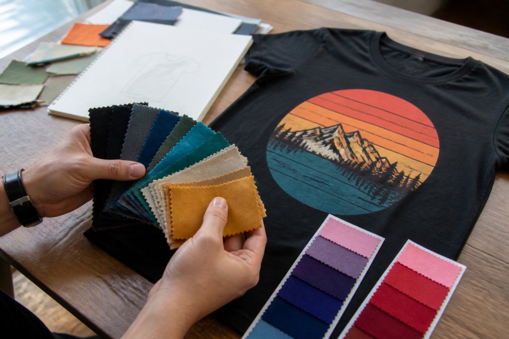
Limit your palette to 3-4 colors maximum. Designs with too many colors look busy and become harder to print, especially with screen printing. A strong two-color design often outperforms a rainbow mess. Think about what your brand is. Are you funny and bold? Stick with high-contrast colors like black and white or bright primary colors. Are you subtle and sophisticated? Muted tones and pastels work better.
Consider the psychology of color. Red grabs attention and triggers energy. Blue feels calm and trustworthy. Yellow is happy but can be hard to read on light garments. Green works well for environmental or wellness brands. Understanding what your color choice communicates helps you reinforce your brand message without saying a word.
Typography and Font Selection for Maximum Impact
Your font choice is a design choice. It sets the tone before anyone reads the words. A playful sans-serif font says something totally different from a bold serif or a handwritten script.
For t-shirt design, readability matters more than anything else. A font that looks cool on your computer screen might be impossible to read when it's printed small on a shirt. Test your font at the actual size you'll use. If it's hard to read at that size, pick something simpler.
Pair fonts strategically. Use one font for your main message and a second for supporting text. Avoid using more than two fonts, it looks amateurish. If you're going for humor, a slightly quirky font can reinforce the joke. If you're building brand authority, stick with clean, professional typefaces.
Weight matters too. A thin, delicate font disappears on fabric. A bold, chunky font commands attention. For apparel, bold is almost always better. Your design needs to survive being seen from across a room, not just up close.
Best Software for T-Shirt Design
You don't need expensive design software to create great t-shirt designs. Canva is free and has templates specifically for apparel. Adobe Creative Suite (Illustrator and Photoshop) gives you professional-level control if you're willing to learn. Affinity Designer is a one-time purchase alternative that doesn't require a subscription.
The real skill isn't the software, it's understanding design principles. You can make something terrible in Photoshop or something beautiful in Canva. Start with what you have access to. If you're testing ideas, free tools work fine. As your business grows and you need more control, upgrade your tools.
T-Shirt Design Trends for Small Business
What Actually Sells Right Now
Nostalgia designs are huge. Retro logos, '80s and '90s references, and vintage aesthetics resonate because they tap into genuine memories. People want to wear their childhood. Pair that with humor, a retro design with a funny twist, and you've got something people will actually buy.
Minimalism is also strong. Simple line drawings, negative space, and designs that look clean on a dark or light garment. The trend toward "less is more" means you don't need elaborate artwork. A single clever image or phrase, executed well, outperforms a crowded design every time.
Personalization is winning. Designs that let people feel like the shirt was made for them specifically. This could be a niche hobby reference, a specific job title, or an inside joke only certain people will get. The narrower the audience, the more passionate the buyer.
Designing for Your Specific Target Audience
Know who you're designing for. A design for accountants looks different from one for pet owners or coffee addicts. The inside joke, the color palette, the tone of voice, all of it should speak directly to that specific person.
Your target demographic determines everything. Gen Z wants bold colors and ironic humor. Millennials respond to nostalgic references and self-aware jokes. Older audiences prefer cleaner designs and less sarcasm.
File Preparation and Print-Ready Design Essentials
Before you send your design to print, make sure it's actually print-ready. A design that looks perfect on screen can print terribly if the file specs are wrong.
Resolution, Format, and Color Mode Checklist
Your design needs to be at least 300 DPI (dots per inch) for print (A Guide to Creating Commercial Print Ready Files). Screen resolution is 72 DPI, which looks fine on a monitor but prints blurry. At 300 DPI, your design will be crisp and sharp on the finished garment.
Common T-Shirt Design Mistakes to Avoid
The most common mistake is overcomplicating the design. New designers try to fit too much into one shirt. Three colors become five. One message becomes three. The design gets busy and loses impact. Simplicity is harder than complexity, but it's what sells.
Frequently Asked Questions
What are the most common t-shirt design mistakes to avoid?
The biggest mistakes? Ignoring garment quality (your design won't save cheap fabric), choosing unreadable fonts, and submitting files at low resolution. Also avoid over-complicated designs that lose detail when printed. Test your design on the actual t-shirt fabric you'll use, not just on screen. Small businesses often rush file preparation, 300 DPI is non-negotiable for professional print quality.
How do I choose the right color palette for my brand's t-shirts?
Start with your brand identity and target demographic. If you're selling humor-driven designs, consider colors that evoke the mood of your jokes. Test color combinations on screen and in print mockups, colors look different on fabric than on your monitor. Limit yourself to 2-4 colors per design for visual hierarchy and print cost control. Consider how colors interact with different garment colors, especially if you're offering multiple shirt options. Neutral base colors (white, black, navy) work with almost any design, while bold palettes attract niche audiences.
What file formats are essential for professional t-shirt printing?
Resolution must be 300 DPI minimum for print quality.
How can I make my t-shirt designs stand out in a crowded market?
Focus on what your brand does best, for humor-driven apparel, lean into originality and relatability. Avoid generic stock images and clichéd phrases. Use strong typography and bold color choices that reflect current design trends while staying true to your brand voice. Create designs that spark conversation or make people laugh when they read them. Consider your target demographic and design specifically for them, not for everyone. Test designs with a small audience before committing to large print runs, and stay updated on emerging trends in apparel design without chasing every fad.