

Table of Contents
- Why Your Signature Color Palette Actually Matters
- Understanding Color Theory Basics: Hue, Saturation, and Value
- Finding the Best Colors for My Skin Tone
- How to Choose a Color Palette for Graphic Tees and Everyday Wear
- Building Your Capsule Wardrobe Around Neutral Bases and Accent Colors
- Testing and Refining Your Palette on a Budget
- Your Signature Color Palette Is Uniquely Yours
- Frequently Asked Questions
Last Updated: September 25, 2026
Why Your Signature Color Palette Actually Matters
Your signature color palette is basically your personal uniform for looking put-together without thinking about it. It's the set of colors that work with your skin, hair, and eyes so well that you stop second-guessing yourself in the mirror.
Here's the thing: most people buy clothes they love in the moment, then wonder why nothing matches when they get home. A real color palette fixes that. When you know your colors, getting dressed becomes easier.
The practical benefit is real, too. A cohesive color palette means your existing wardrobe suddenly feels bigger. That teal shirt works with the navy pants. The olive hoodie pairs with the cream sweater. You're not stuck buying more stuff, you're just using what you have smarter.
Understanding Color Theory Basics: Hue, Saturation, and Value
Before you can build your palette, you need to know what you're actually looking at. Color theory breaks down into three simple parts: hue, saturation, and value.
Hue is just the color itself, red, blue, yellow, green. It's what you see on a basic color wheel. When someone says "I look good in warm colors," they're really talking about hues that sit on the warm side of the spectrum.
Saturation measures how intense a color is. A bright, vivid red is highly saturated. A dusty rose is desaturated, it's the same red, but muted with gray mixed in. This matters because some people look better in bold, saturated colors while others shine in softer, less intense versions.
Value is how light or dark a color is. Think of it like the brightness dial on your TV. A pale pink has high value. A deep burgundy has low value. Your personal contrast level, how much your skin stands out against your hair and eyes, affects which values work best for you.
Most people skip this part and jump straight to "I'm a spring" or "I'm an autumn."
Finding the Best Colors for My Skin Tone
The foundation of any color palette starts with your skin. Not your undertone alone, your whole complexion picture, including how much contrast you have with your hair and eyes.
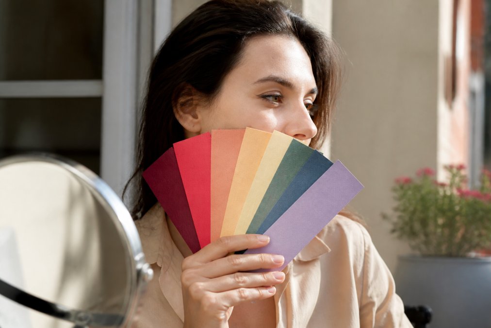
Warm vs. Cool Undertones
Your undertone is the subtle hue beneath your skin's surface.
Here's how to figure it out: Look at your wrist in natural light. Do the veins look more green or more blue? Green leans warm. Blue leans cool.
But undertone is just the starting point.
Testing Colors Against Natural Light
Artificial lighting lies. That color that looked perfect in the fitting room under fluorescent lights might look completely off in daylight.
When you're testing a color, hold it up to your face in natural light, near a window, ideally.
If a color makes you look washed out or tired, it's not your color, no matter how much you love it.
How to Choose a Color Palette for Graphic Tees and Everyday Wear
Building a real color palette for everyday wear means picking colors that actually work together, not just colors you like individually.
Start with neutrals. These are your base, the colors that anchor everything else. Neutrals don't have to be boring beige and black. They can be warm (cream, camel, olive) or cool (gray, navy, cool white).
Next, add 3-5 accent colors. These are the colors that add personality and make outfits feel intentional. Pick colors you genuinely love.
Graphic tees are perfect for testing this. A funny tee in one of your palette colors becomes the anchor for an outfit.
Building Your Capsule Wardrobe Around Neutral Bases and Accent Colors
A capsule wardrobe built on your color palette is basically a cheat code for looking put-together without overthinking it. You're not buying random pieces; you're building a system where everything works together.
Start With Neutral Anchors
Neutral basics are your foundation.
- One or two solid t-shirts in your best neutral
- A neutral hoodie for layering (comfort always wins)
The trick: all your neutrals should work with each other.
Layer In Accent Pieces
Once your neutrals are locked in, add 3-5 accent colors:
- Graphic tees in your palette colors (these are your personality pieces)
- A hoodie in a slightly bolder accent shade
The key is repetition. When your basics all work together, you can throw any accent piece on top and it works.
The Sustainable Angle: Mine Your Existing Closet First
Here's what most guides skip: you probably already own pieces in your signature colors.
Before you buy anything new, do a closet audit:
- Pull out every piece you actually wear (not the stuff you feel guilty about).
- Lay them out by color.
- Notice which colors appear most often. Those are your real signature colors, not the ones you think you should have.
Once you see the pattern, you can build around what you already own instead of starting from scratch. That means less waste, less spending, and a wardrobe that actually reflects your real taste.
If you find gaps (say, you need a neutral hoodie in a color you don't own yet), fill those strategically.
Make Gift-Giving Easier
When your palette is clear, gift-giving becomes simple. A friend can grab a graphic tee, a mug, or a blanket in your colors and it'll actually match your style. A funny tee in your palette colors becomes an instant outfit anchor.
Testing and Refining Your Palette on a Budget
You don't need to buy a whole new wardrobe to figure out your colors. Test first, buy later, and pay attention to how colors actually make you feel, not just how they look.
The Low-Cost Testing Method
Start with what you already own. Lay out your favorite pieces and ask: What colors show up most? Those are clues about your real palette, not the one you think you should have.
Next, use affordable, easy-to-swap test pieces:
- Graphic tees in different colors, They're affordable, returnable, and you wear them enough to get real feedback over days, not minutes.
- Scarves, accessories, or even a mug in test colors, Smaller commitments that still let you live with a color before committing.
- Candles in different hues, Sounds odd, but a candle in a test color sits in your space and you'll notice whether it energizes or drains you over a week.
Wear each test piece for at least 3-5 days. This matters: a color might look good in a mirror but feel wrong after eight hours of wearing it.
- Do you reach for it again, or does it sit in the drawer?
- How do you feel in it? Confident? Tired? Energized? Anxious?
That last point is key and often overlooked.
Sensory Preferences Matter More Than Rules
If you're neurodivergent, have sensory sensitivities, or just notice that certain colors make you feel off even if they theoretically "should" work for you, trust that.
Pay attention to:
- Visual intensity: Do bold, saturated colors energize you or overwhelm you? Build your palette accordingly.
- Emotional response: Does a color make you feel calm, anxious, confident, or drained? That's information.
- Texture + color combo: Sometimes it's not the color alone, it's how that color feels against your skin. A soft, muted blue in a cozy hoodie might feel completely different than a bright blue in a stiff cotton tee.
Patterns Emerge Over Time
After 3-4 weeks of testing, you'll notice which colors you keep reaching for and which you avoid. You'll feel the difference between colors that make you look good and colors that make you feel good. Sometimes they're the same; sometimes they're not. Honor both.
Your Signature Color Palette Is Uniquely Yours
Here's what most guides miss: your palette doesn't have to match anyone else's. What matters is that your colors make you feel like yourself.
Frequently Asked Questions
How do I determine my personal color palette if I don't know my undertone?
Start by checking the veins on your wrist in natural light. Blue or purple veins suggest cool undertones; green or olive suggests warm undertones. Then hold fabric swatches in different hues against your skin. Notice which colors make you look vibrant and which make you look washed out. Your undertone is the foundation, once you know it, you can identify which hues, saturation levels, and values work best for your signature color palette.
Can I build a signature color palette based on the clothes I already wear?
Absolutely. Look at the colors you naturally reach for and feel confident in, your closet already knows your palette. Pull out 5-10 favorite pieces and lay them out. Notice the dominant hues, whether they're saturated or muted, and their overall value (light or dark). These pieces reveal your instinctive color harmony preferences. From there, you can intentionally expand by adding complementary colors that match the same undertone and saturation level.
What's the difference between seasonal color analysis and a signature color palette?
Seasonal color analysis assigns you to a season (spring, summer, fall, winter) based on undertone, contrast, and saturation. A signature color palette is more personal, it's the specific hues, neutrals, and accent colors that make you feel like yourself. You can use seasonal theory as a starting point, but your signature palette should reflect your lifestyle, preferences, and the colors that genuinely resonate with you, not just what theory says you 'should' wear.
How do I know if my colors are truly cohesive or just random pieces that happen to be the same color?
Cohesion comes from consistency in undertone, saturation, and value, not just matching hue names. Lay out potential pieces side by side in natural light. Do they feel like they belong together, or do some look jarring? A true color palette has visual harmony: the colors complement each other, your skin tone, and your personal style.
Finding your signature color palette isn't about following rules, it's about understanding what makes you feel confident and building from there. Start with testing, pay attention to what actually works on you, and let your palette evolve as you learn more about yourself. The colors that matter most are the ones that make you reach for them again and again.